Tuesday 29 June 2010

Artistic Book Review no.1

Welcome to my very first artistic book review and as I am quite a book nerd, I thought I might just uncover some books that will help in the artistic factor. I will be reviewing one book each 3-4 weeks (or try to) that can be helpful in artistic development whether it is art, design or both. There are several reasons why this is being written, however main purposes of this reviews and the ones to come are the following:
  1. The college library might not have in offer yet, therefore people won't know about them. Hopefully with these reviews, they will become available.
  2. Topics offered under a different author and/or book. Books differ from one another of the same topics; if you can't find the information in what's available already, the reviews are here to give you yet another option consideration.
  3. Some of them may still be brand new and out of the printing press. Poor things need some proper lighting!
  4. Some people sometimes need eye-openers; so many titles to choose from that they really don't know where to go or what to choose. In a few words, trying to dodge or avoid confusion.
  5. Internet is overrated, big time. It can be as powerful as a book, however most of the times it is misinformative and/or misleading so do not rely on it too much for research.
I love my collection of books but I still rely on the Library for information. There are some books that I might not be able to afford or find, so I wholeheartedly support the Library. I personally try and build my own private collection to be honest; they will be there for life and it saves me precious time. You never know when you need them. (and I have a problem with overdue books)

Tip: Books are there to help you out and not to do your work, so do not just stick to just reading and do not plagarize. Gather information, process it and sketch it out. Knowledge is power but is only 1/10th of the work needed to be done; one learned technique, process or fact can drive your project from a mere pass to a flying distinction if you experiment enough.

So, what's my first book?


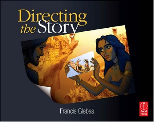
"Directing the Story: Professional Storytelling and Storyboarding Techniques for Live Action and Animation"
by Francis Glebas


Personal Experience:
When I saw the cover of this book I just knew it had to be on my shelf; a well designed cover of a book can tell you if it's platinum, gold, copper or charcoal quality. When I read this book it was even better, I literally felt like I have just found a diamond. This book is an eye-opener, a major motivator and a classroom in
346 pages. The structure of the book is beautiful and even if you're not really fond of reading, this will keep you hooked all the way. It is mainly targeted to illustrators that are interested in pursuing the career of animated film-making, however I found out that this book also applies for cartoonists that wish to plan out a long-series comicbooks story, just because the techniques offered help out that much.


In a nutshell: This book concerns about what it says on its cover; the storytelling part and whatever it involves with it. Just to let you know, this is not a book that will tell you how do the actual animation, only the pre-stages. Some might (including our dear lecturers) say that the editing part of the movie is the most crucial of all. Such a fact is true, however this book turns this theory upside down as it might not always be the case for animation or so the author says. Glebas begins with the common question of "why do we watch movies?". From that he builds up a step-by-step lesson of your life on how to script, beat box and storyboard your story...in preparation of making the actual animation of course.

That is not all; the book also go into extensive detail on several things such as how to build a good story, how to make interesting character designs, interaction within the characters and with the story itself and much, much more. Throughout the whole book there is also a continuous storyboard example flowing of a modified version of "1001 Arabian Nights", with the character Scheherezade playing as the main character. By following (and not just reading) this book makes you realize that the initial stages are just as important as the final assortments, re-organisation and touches, such as editing and special effects. Wonderfully written book, accompanied with a well-fitting page design, illustrations are at a generous abundance, vivid examples and personal suggestions, tips and hints from the author's personal life experiences in the career. Needless to say, this book is a must-have for animators and cartoonists alike, excellent starter for amateurs.

About the Author: Francis Glebas is a storyboard artist, teacher, director and writer. It can safely be said that Glebas has spent most of his life with the Disney Animation Studios. He has storyboarded animations that most probably built our childhood which are the following titles: Aladdin, Pocahontas, Hunchback of Notre Dame, Fantasia 2000 and Hercules. Other films that he has storyboarded are Dinosaur, Treasure Planet and Fox and the Hound 2.


Saturday 26 June 2010

Resource Furniture

Just came across this amazing video, which reminded me of modular furniture and "Design for Need" that some degree students were working on this year at MCAST Art & Design.

Friday 25 June 2010

More bad typography

Yet another post on bad typography, just came across a sweet "Guide to Fonts" or  better "What Your Awful Font Choices Say About You"

Read more on Cracked.com

Thursday 24 June 2010

"Għadni Ma Nafx", filmin ta' Emerson Vella


Something I've been working on for the last couple of weeks for my MCAST Final Major Project.

Please turn up the volume of your speakers, you should hear some distinct low-frequency rumbling at the beginning.

Monday 21 June 2010

Overused

Now I have nothing against brushes, but guys there are plenty of great brushes around. Here are some two cool sites http://qbrushes.net/ and http://www.brusheezy.com/ I find it so strange that everyone keeps using the same brushes (smoke brush much?) 

The smoke brush; such a beautiful brush yet so overused. I must have seen it in at least 10 different projects this year. Of course I’m guilty of using the same brushes too sometimes, especially when it’s a quick job (such as the title of this blog!) but take your time when using brushes, there are plenty of good ones around, keep looking, you can never have enough brushes and enough typefaces. Of course it’s so much better if you can create your own, but let’s talk about typefaces now.


This hurts my eyes

Overused typefaces… we’ve all seen them, and we’ve all used them (well not all of them I hope). Guys, avoid falling in love with a typeface and using it over and over again. Find a home for your typeface, on it’s special little poster/ website and leave it there. For your next project, find a new one! There are plenty of overused typefaces, but here’s a list of the ones I see the most:
Again I admit, I have used some of these before, but after seeing them being used everywhere it's kind of hard to appreciate them, even if they are nicely composed with the image. (Helvetica is excused... only sometimes!) Well then, any others you'd like to add?

PS: For the record, the "Overused" banner above was created in a few mins using this guide: http://www.blog.spoongraphics.co.uk/tutorials/create-a-cool-wet-ink-typography-effect-in-photoshop
The brushes suggested are actually pretty interesting if used correctly :)


Sunday 20 June 2010

bODY_rEMIX/gOLDBERG_vARIATIONS

A ballet in two acts, it is a combination of solos, duos, trios and group work, and uses many accessories as means for different movement and expression - “the work’s movements plumb the insoluble mystery of the body, of the living being.”


Marie Chouinard, OC (born 14 May 1955) is a Canadian dancer, choreographer, and dance company director.

Born in Quebec City, Quebec, Chouinard early developed a sensational reputation with a series of brief dance vignettes such as 1978's
Cristallisation, in which she dropped raw eggs and Danse pour un homme habillé de noir et qui porte un revolver (Dance for a man dressed in black and carrying a revolver) in 1979. In 1980, the Art Gallery of Ontario banned her because of a urination scene in Petite danse sans nom (Little dance without a name). She continued to flirt with scandal with 1981's Danseuse-performeuse cherche amoureux or amoureuse pour la nuit du 1er juin (Dancer-performer seeks male or female lover for the night of 1 June) in 1981, in which she auctioned herself off, and Marie Chien Noir in 1982, which showed masturbation.

After a successful career as a soloist, in 1990 she founded the Compagnie Marie Chouinard, in Montreal. Her company went on to tour internationally, and gain accolades. Notable were her performance of Rite of Spring, set to the score of Stravinsky and accompanied by Prelude to the Afternoon of a Faun, a short performance set to the music of Debussy.

Monday 14 June 2010

David Lynch - Ideas

Here is a video where my favourite Director of all time, David Lynch, talks about Ideas and fishing. This is one problem that many students (and at times even myself) seem to struggle with; catching all the small fish; coming up with a seemingly innovative idea, and not realising that it has been done so many times before. This is why research is so important, as is the ambition to explore obscure material; to be able to catch "The Big Fish"... Anyway, here's David Lynch, and following him are a few trailers of some of his films which I believe are a must-see for any artist / designer.


Sunday 13 June 2010

For the meat lovers...


Jan Švankmajer (born 4 September 1934) is a Czech surrealist artist. His work spans several media. He is known for his surreal animations and features, which have greatly influenced other artists such as Tim Burton, Terry Gilliam, The Brothers Quay, Shane Acker, Sir Tijn Po, and many others.

Meat Love is a short film directed and animated by Jan Švankmajer, released in 1989. It appears as a commercial in Švankmajer's feature-length film Otesánek. It has also been shown on MTV.

It depicts two slices of steak, personified as two individual beings with a consciousness, that become aware of each other and form a romantic relationship, showing the steaks dancing with one another. This soon leads to passionate love, exemplified by the steaks rolling around, passionately, on a plate of flour. Their passion is killed, however, when the steaks are placed in a frying pan.

Saturday 12 June 2010

Skimmed Promo Video Launch

Skimmed - Napoleon Music Video Promo from Eleonora Rose Abela on Vimeo.


Something I'm currently working on with my friend Eleonora Rose Abela

Thursday 10 June 2010

Performance Art: Abramovic, Marina / Ulay. "Expanding in Space" Italy, 1977


"In a chosen space.
Two mobile columns are installed among stationery columns. The stationery and mobile columns look identical. The mobile columns are twice the weight of our bodies. We stand back to back between them. We move simultaneously towards the mobile columns hitting them repeatedly with our bodies and moving them towards the stationery columns."


Marina Abramovic
b 1946 in Belgrade (YU); 1965-70 studied painting at the Academy of Fine Arts, Belgrade (YU); texts, drawings and conceptual works from 1968; performances from 1973; 1973-75 taught at the Academy of Fine Arts, Novi Sad (YU).

Ulay (F. Uwe Laysiepen)
b 1943 in Solingen; 1962–68 studied photography after an apprenticeship as a mechanical engineer; worked in the fields of experimental photography, film and environment until 1975; Professor at the Staatliche Hochschule für Gestaltung, Karlsruhe since 1998.

1976 Marina Abramovic und Ulay start to co-operate as artists and to live together; 1989 the two artists part with a last joint action, the «Great Wall Walk;» both live and work in Amsterdam (NL).

Marina Abramovic and Ulay have made themselves again and again the topic of performances and actions. Gender specific roles, the opposing models of male and female body are being questioned in public up to its physical and psychic limits. The borderline between art and life seems to be extremely thin, especially considering how often a real danger becomes part of the artistic concept. Marina Abramovic and Ulay irritate profoundly the visitors of a performance when they beat each other until exhaustion or physically clash. The duration of time stretches endlessly so that the shere physical impact is extreme. The performances rely on radical introspection and artistic exhibition at the same time, which only documents their long symbiotic relationship as a couple: «Art Vital—no fixed living-place, permanent movement, direct contact, local relation, self-selection, passing limitations, taking risks, mobile energy, no rehearsal, no predicted end, no repetition.» This artistic credo from 1976 on their body of work entitled «Relation Work» addresses the singularity of their performances. Video is the medium of recording and direct communication, rendering the intensity and duration of the performances.


Wednesday 9 June 2010

Pyrats: The Short Animation

Pyrats is a short animation done by a teamwork consisting of 5 students in the the college of animation "Gobelins l'école de l'image" in Paris, France.

this excellent-made animation was done for as an opening for an international animation festival, it had more than three software programs included and more than just co-operation with the group within, for they have included a sound designer foreign from their team. Programs used for the animation are the following

  • Alias MAYA 6.5
  • Photoshop CS
  • After effects 6.5
  • Crater Software CTP
  • Flash

Their animation is available in a separate website dedicated for this animation alone however in it they have also included several character designs, background designs and model sheets that were necessary in order to make this animation to be performed. Has it not been published that it was student-made, one wouldn't really notice.

Website: http://www.pyrats.net/

Short film: Khoda. "What if you watch a film and whenever you pause it, you face a painting?"


What if you watch a film and whenever you pause it, you face a painting?

This idea inspired Reza Dolatabadi to make Khoda. Over 6000 paintings were painstakingly produced during two years to create a five minutes film that would meet high personal standards. Khoda is a psychological thriller; a student project which was seen as a ‘mission impossible’ by many people but eventually proved possible!

Credits:
Director and art director: Reza Dolatabadi
Written by Reza Dolatabadi & Mark Szalos Farkas
Animation by Adam Thomson
Music by Hamed Mafakheri
  • Winner of the Best Animation Canary Wharf Film Festival (London) Aug, 2008
  • Winner of the Best Student Animation Flip Festival (Birmingham) 2008
  • Winner of the Best Student Animation, Royal Television Society Award, Scotland (rts) 2009
  • Official selection for the "Best Short Film Program” at Waterford Film Festival (Ireland) November 2008
_______________
Links
Reza Dolatabadi - RezaArt.com

Tuesday 8 June 2010

Herb and Dorothy Vogel. "You don't have to be a Rockefeller to collect art."


Herbert and Dorothy Vogel are American art collectors.

Herbert Vogel, who worked as a postal clerk with the United States Postal Service, and Dorothy Vogel, who was a librarian in the Brooklyn Public Library, built a large and impressive contemporary art collection on their modest income. Though their focus isconceptual art and minimalist art, the collection also includes noteworthy post minimalist work.

They amassed a collection of over 4,782 works, which they kept in their New York City apartment. In 1992, they decided to transfer the entire collection to the National Gallery of Art. More recently, in late 2008, they launched The Dorothy and Herbert Vogel Collection: Fifty Works for Fifty States along with the National Gallery of Art, the National Endowment for the Arts, and the Institute of Museum and Library Services. The program will donate 2,500 works to 50 institutions across 50 states and will be accompanied by a book with the same name.

In 2008, an award winning documentary about their story, Herb and Dorothy, was released.


Photoshop Colouring Tutorial

Inspirational Artist Warren Louw!

This is a tutorial on one of the methods I use to colour line art – even though I don’t do that much. It’s a Street Fighter Fan art piece I did quite a while back… I hope you’ll enjoy seeing some sneaks and the process involved in creating it!

I will not explain any drawing techniques or approaches since the main focus is the colouring approach. This is not THE way of colouring line art but just A way of doing it. Don’t get confused with the images – they’re there to help you. Read and understand. I highly recommend a basic idea of Photoshop for this tutorial since it’s a bit for intermediate to advance. I have included in most of my images the Layers window so you can have an idea on how to organise and sort layers.

Pencilling and Inking.

I don’t like to scan and paint on top of my scanned work. I do my digital works from start to finish through Photoshop. So below are two images – one of the loose work (like a pencil drawing) and the other is a refined of the first (like inking pencils). They were done both on separate layers, keeping the loose sketch underneath the polished lines.

Once you have the clean line work on a separate layer, put it on top and set its blending mode to Multiply.

>>Keep in mind to make this layer as clean as possible, so take your time working on it.


Preparing the brush

For this step (especially) use the default round brush with NO pressure sensitivity on Opacity or Flow. You want to make your brushwork strong without fading. Below is an image of how your settings should be.

>>To access to this window you can either go to WINDOW>BRUSHES or simply press F5.


Don’t Panic!

This is an important step that will help up later on. Take your time to understand it. Ok here we go…

We want to create Group Folders for some specific things in our drawing, for example in this case I created one for the Skin Tones, another for the Clothes, for the Gauntlets etc. For the first Folder “Skin Tones” I did a new layer and decided to name it “Base 1 - Shoulder”. Then I picked up a very strong colour – in this case green. I painted the shoulder on its own so that later on it will not mix with her face. After I created another Group Folder for her Gauntlets and did the same thing, using of course a different colour. Repeat this process while NAMING the layers. You can skip the names if you want, but the more order you have in your layers window, the better the workflow!

>> You have to do your best on not going out of your lines. Its sounds pretty obvious, but be as precise as possible to the contours… we’ll need them in the next stages!


Once you’ve done painting each section and grouping them in Group Folders respectively, we can prepare to move forward. This is how it was for my image. Also note that when I had all the group folders finished, I created another Group Folder to have these sections all together – just like a family! :) Try not to make TOO many of these folders. Just use a folder to separate one thing from the other. Keep things simple!

>> She looks weird huh?! No, she’s not She-Hulk!


Channelling our selections

Ok remember when I told you to keep things simple… here’s why. We have to go to our layers one at a time, and get the selection of the block colour we laid in earlier. It’s very simple to do so breathe if you don’t know! Inhale - exhale!

Click on the first layer, drag your mouse over the layer thumbnail, hold the CTRL button (Cmd for Mac) and click on the layer thumbnail. This will automatically select the border of what we painted in that particular layer. Below is an image of how it looks.


With our selection on, go to SELECT>SAVE SELECTION and a window like the one below will pop up. Name it like the respective layer (or whatever you will feel suitable!). Also make sure that the Channel bar is set to New (by default).

Do this for all the other layers – take your time doing it – no hurry! Remember; load the selection from the layer thumbnail, save selection and bam; go for the next section!


Once you have all the sections saved, you can go to the Channels window which is located next to the Layers window. There you will find that all your selections have their own Channel – which is what we want. Don’t rush and click on them! The fun part will start soon…

Say you want to work with the first part first – being the shoulders. Just similar to what we did earlier, drag your mouse on over the particular channel that has that selection area in it (that’s why it’s good to name them), hold CTRL (Cmd) and click on the thumbnail of that channel layer. Here’s another image for the sake of it:


The Fun Starts...

Having the selection on, go back to your Layers Window and create a new Group Folder to contain the coloured layers. With that selection on you can start painting freely without having to worry about going out. The reason of doing the channels is so we can go back and forth from one section to another whenever we want.

>> The Selection lines moving around and constantly switching on and off are a pain in your ass? Just press CTRL+H (cmd+H) to hide them. Re-press it to get them back visible. That easy!

Here’s how I organised my Layers and started to colour.


Having our channels help us change the background to the final image whenever we want….Here are the initial background ideas:


Below is my finished piece which I used this particular process for. I hope you learned something from it. I know it might be a bit complicated, but I did my best on keeping things as simple as possible. If anyone finds some difficulties or questions, feel free to drop it as comment...


Wanna pay me a visit --- go to my blog!
And the inspiration behind the piece - Warren Louw


Peace out.